


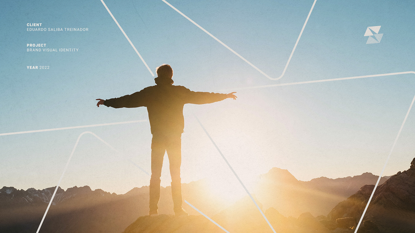


Brand Visual Identity for
EDUARDO SALIBA TREINADOR
ABOUT
Eduardo Saliba is a physical educator, passionate about sports and a specialist in biodynamics and training. He is a pioneer and authority in rehabilitation in Juatuba / MG, a region where his family has a lot of visibility and tradition.
Since 2008, he has been working as a personal trainer at the best gym in the city, Qually Center, which he became the owner in 2015. With a privileged location, in a green area and with an unparalleled (physical and technical) structure, the academy stands out from the competition and currently begins an important phase in its evolution process.
GOAL
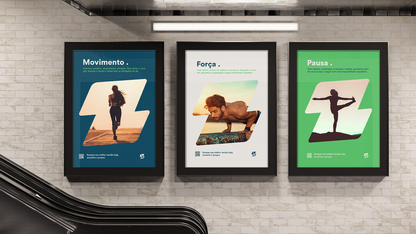
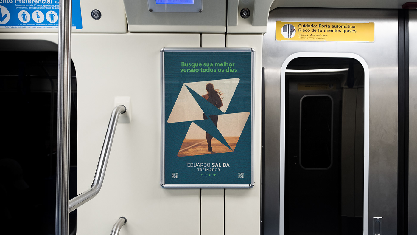
Increase the perception of value of the Eduardo Saliba brand through the elaboration of its visual identity, so that it impacts and transmits to the public the main values of the brand, its message, personality and positioning. Highlight professionalism, thus making it possible to increase the average ticket in the services provided, attract more customers and build community.
challenge
The great challenge of this project was to find a common denominator between the coach's personal style and the behavior of his clients and prospects.
It was necessary to balance vibrant characteristics (energy / adventure) related to the universe of physical activity, gym, sports, etc.. and characteristics of rehabilitation, caution and longevity that are more linked to a more balanced and mature style. Appreciation for quality of life, which brings balance, proved to be the main intersection. That was the guiding concept!


solutions
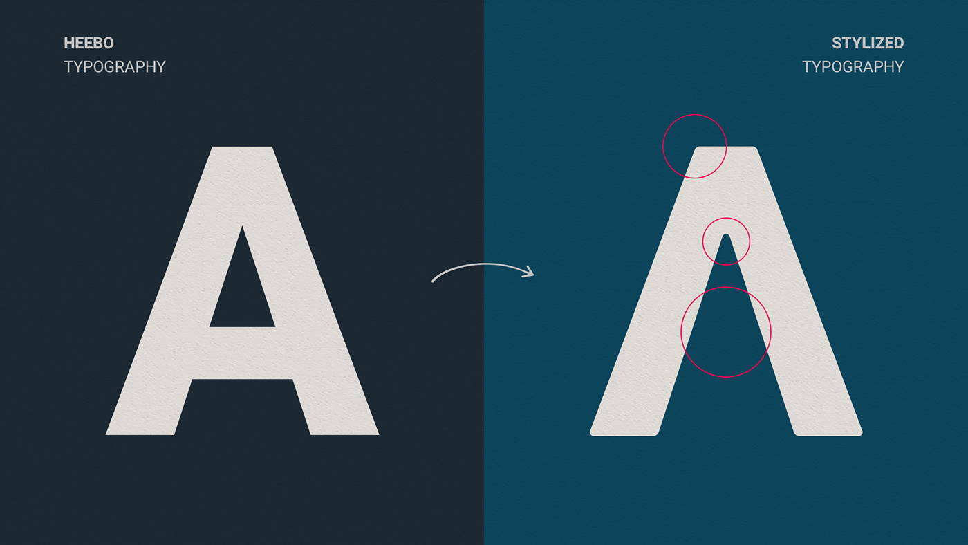
typography
Modern, clean, easy to read, free-to-use sans serif font for the web. Chosen based on the public profile and stylized to bring personality and exclusivity. slightly rounded corners and personalized letter A, simulating an up arrow: ascension, evolution. Typographic body with greater weight for the surname.
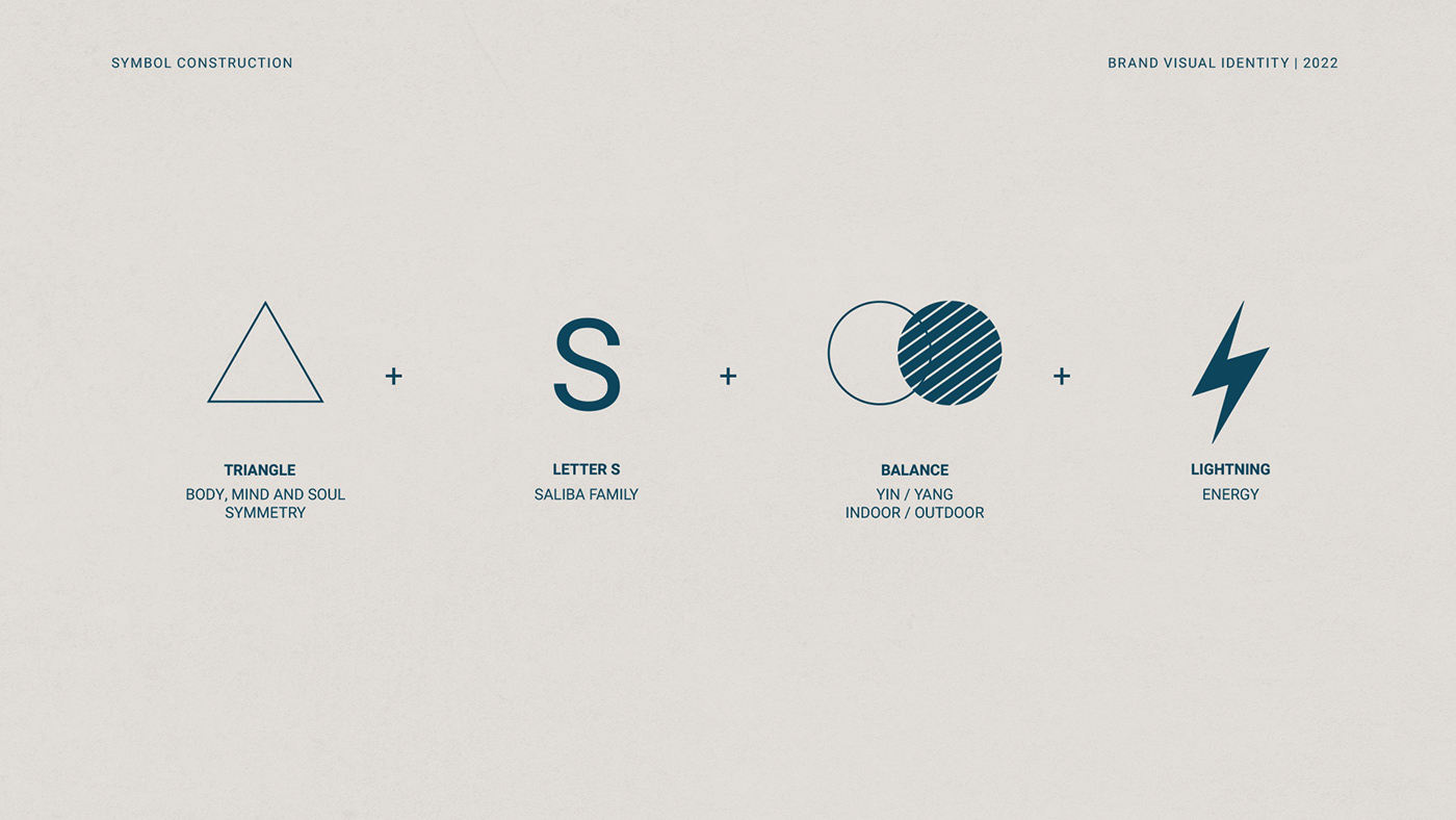
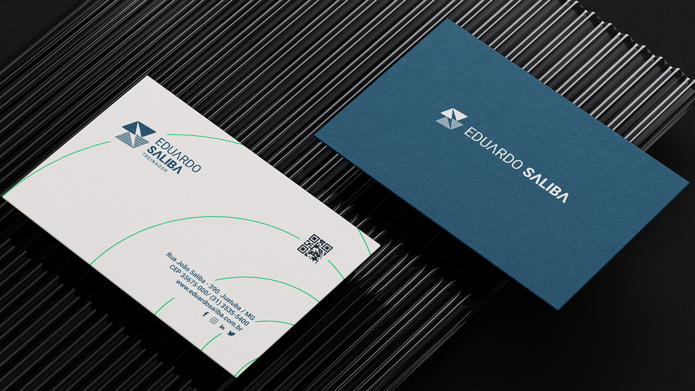
SYMBOL
The junction of the elements: balance; letter S - Saliba; indoor and outdoor environments - where physical activities are practiced and energy, the main concept for the symbol emerges.
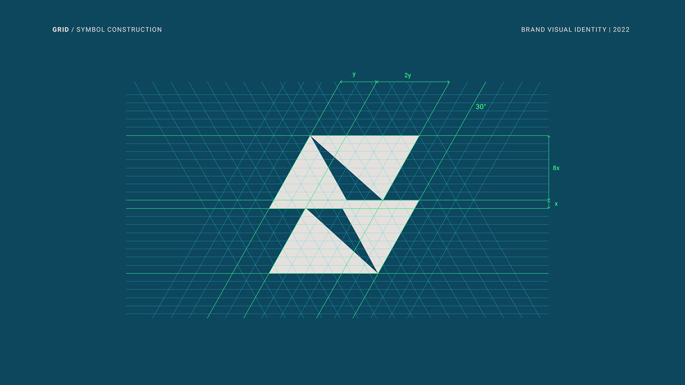
GRID
The construction of the symbol was made on a grid to maintain perfect balance and proportions. After the first phase, a rounded finish was applied, giving movement and a more pleasant aesthetic, in keeping with the project. As final adjustments were applied: slight rotation on the symbol as a whole, addition of 'grid' at the bottom to increase contrast and finishes in the contours and spaces between the triangles to give harmony.


thanks.
if you are still here, please leave a kind comment. your feedback is very important to my development.
if you are still here, please leave a kind comment. your feedback is very important to my development.


